How we used maps to help a government agency figure out its technology strategy
Danny Buerkli, 26 April 2024
This post was originally published on the staatslabor Linkedin page.
Many organizations find it challenging to respond to technological change. How do you distinguish between urgent necessity and hype? And how do you know what to do, once you believe something must be done? We recently worked with a national government agency on those problems. They felt disoriented by the speed by which they were being overtaken by technological developments.
This agency operates in a specific corner of the education space. The public service they provide is important for society, but could conceivably also be provided by the private sector – though there are good arguments for why this ought to be a government task.
Unusually for a government entity, they are competing with private providers. This meant that the organization would, over time, lose its mandate, if it did not manage to use technology appropriately and offer these services to the standard that their clients have come to expect.
We worked with a small team of government officials on a short project of just a few weeks to help them decide on their tech strategy.
To do this we used Wardley Maps, a method developed by Simon Wardley. His maps are a way of anticipating change and discovering useful strategies. The agency found the results compelling. And because what we did was useful and straightforward at the same time, we felt that by sharing what we did others might benefit too.
First, let’s get three quick disclaimers out of the way:
We will inevitably gloss over important details. It’s impossible to pack in all the nuance and keep it readable at the same time.
We are not naming the government entity. This means that the examples we can provide are unfortunately not as specific as you might hope.
Finally, if you are not familiar with Wardley Mapping, we suggest more detailed readings at the end. It is a remarkably useful way of looking at the world, so any time spent understanding the method more deeply is time well spent.
With all that out of the way, how did we help this government entity make sense of technological change?
First we drafted a (Wardley) map of what they do. This helped us ground all subsequent discussions in the specific details of their operation.
With that map in hand, we looked at where technological developments, such as Large Language Models (LLMs, e.g. GPT-4 or Claude 3), would impact their business.
Lastly, since we now had an agreed upon description of what they were doing and how technology would influence their operation, we discussed what they could and should do about it.
Let’s look at each of these steps in turn.
Step 1: Mapping the business
The first step was to draw a map of what the agency does, i.e. of the service it provides. We did this over the course of three two-hour sessions, together with a small working group of executives.
This map grounded all subsequent discussions over the impact of technology on the agency’s business, as described by the executives themselves.
In between the sessions we would clean up the maps, so that we would have a tidy basis for our next discussion.
This first step happened over the course of a few weeks. We could have gone faster and done it within a week or less, if required. Refining the maps over the course of several sessions helped everyone get comfortable with the method and, more importantly, what the map meant.
The aim was not to draw a perfect map. Like with any map, we wanted to hit the right level of abstraction. All we needed was an artifact we could use to guide our discussions.
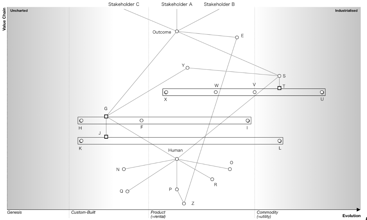
Quick interlude: You are looking at an (anonymized) Wardley Map. The general idea is this: The map shows the value chain of the business. The chains are made up of components. Each component depends on those below.
The vertical axis shows visibility to an end user. The higher up a component, the more visible it is to the user.
The horizontal axis plots the evolutionary state of each component. The basic claim is that under conditions of competition, components evolve from genesis to custom-built, from there to product/rental and finally to commodity.
See the recommended readings below for more detailed introductions to Wardley Mapping.
Step 2: Identifying the impact of technology
Now that we had a map the group felt was a good enough representation of their activities, we turned to the impact different technologies would have.
We took a list of key technological shifts they were interested in (think LLMs, robotics, blockchain, etc.), looked at each one in turn and asked “where and how will this impact your business?”.
This meant doing two things:
First, in many instances we already had an intuition where, for example, LLMs would impact the business. We then used the map to pinpoint the specific component that would be affected. This grounded everyone’s intuition and translated arguments into a shared, visual language.
Second, we went through every component on the map and asked how LLMs (or any of the other technologies on the list) might conceivably impact that element. This way we were sure not to overlook an important effect.
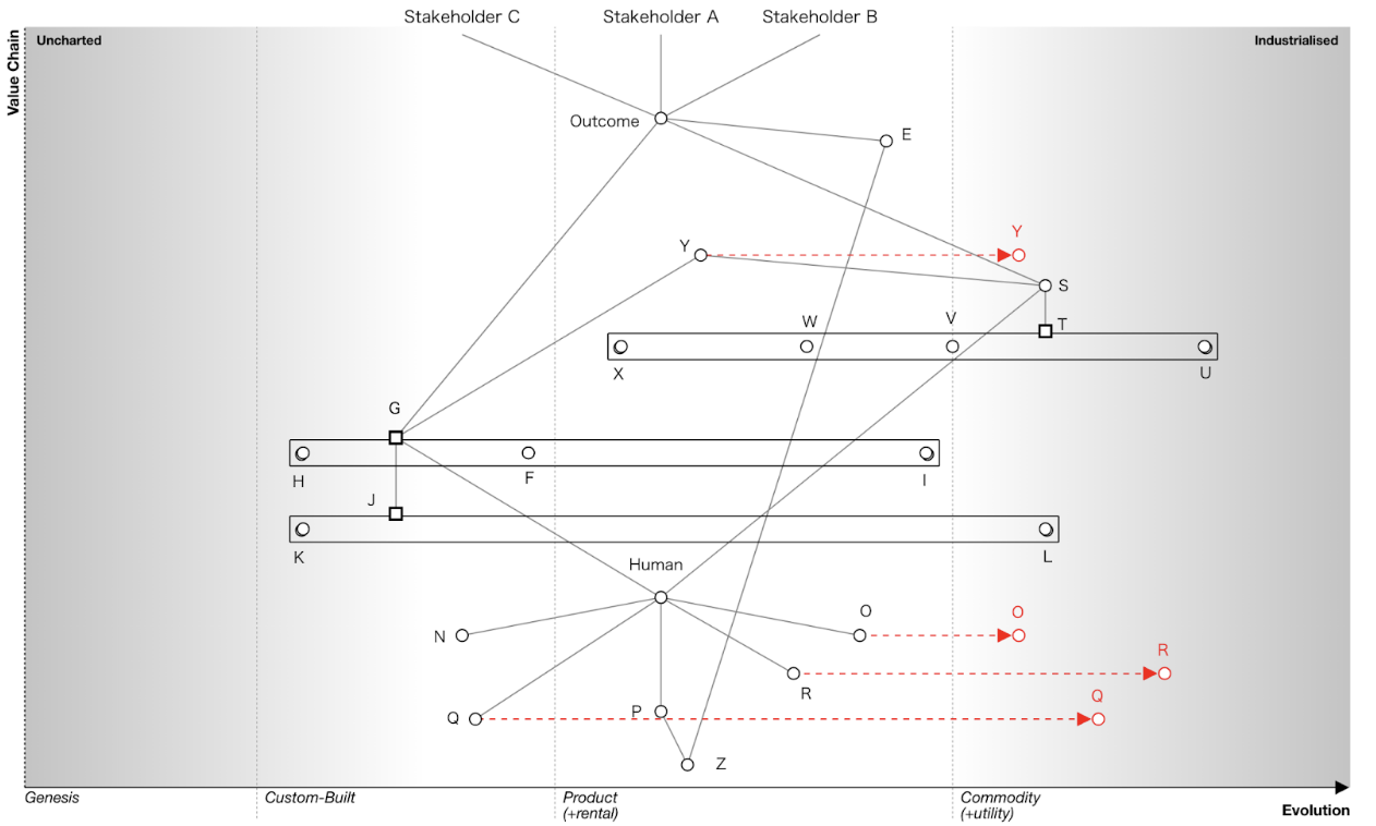
As a result of these two exercises it quickly became apparent that LLMs were in all likelihood going to have a major impact on the agency. They would affect a large number of central components in the value chain. Virtual Reality, on the other hand, would only impact a minor, non-strategic element in the value chain.
The group quickly gained clarity on where it was worth spending time debating potential consequences of technological shifts and where we could safely move on. Because the maps helped anchor all conversations in the organization’s operational reality, we avoided spending lots of time debating questions that would have ultimately no business impact.
Step 3: Making strategic choices
With the elements above in hand, we turned to strategy.
Depending on where on the map technology was impacting components, different responses were needed.
If the component in question was relatively mature (i.e. existing on the right-hand side of the map) this implied the organization needed to react quickly, follow “best practice” and make use of what the market had decided was the winning solution. In other words: there was nothing left to explore or figure out, the organization needed to get with the program and catch up as quickly as possible.
If the components where change was happening were placed in the middle of the map, there might be space to shape what would happen. This is where the organization could make a difference with shrewd, strategic moves.
If, lastly, the components affected by technological change were less evolved (i.e. towards the left-hand side of the map) this meant that there would be a lot of uncertainty around how the future would unfold and therefore a lot of room for exploration. Given the limited resources of the agency we felt that investments here would be too risky. Better to keep a watching brief and, given the considerable amounts of inertia in the environment, not worry about those components too much in the short term.

Let’s take a closer look at the middle category where we saw potential for strategic action. In particular, one specific strategic gameplay stood out.
Without being able to name the specific agency and its service this is by necessity going to be somewhat cryptic, but the general idea was this:
There was a component which was in high demand, but could only be accessed by booking a series of appointments with a human interlocutor. The situation was structurally similar to how you can only get results from a blood test if you go see a doctor. We had, however, reason to believe that the commoditization of LLMs would soon allow this component to evolve to a commodity too.
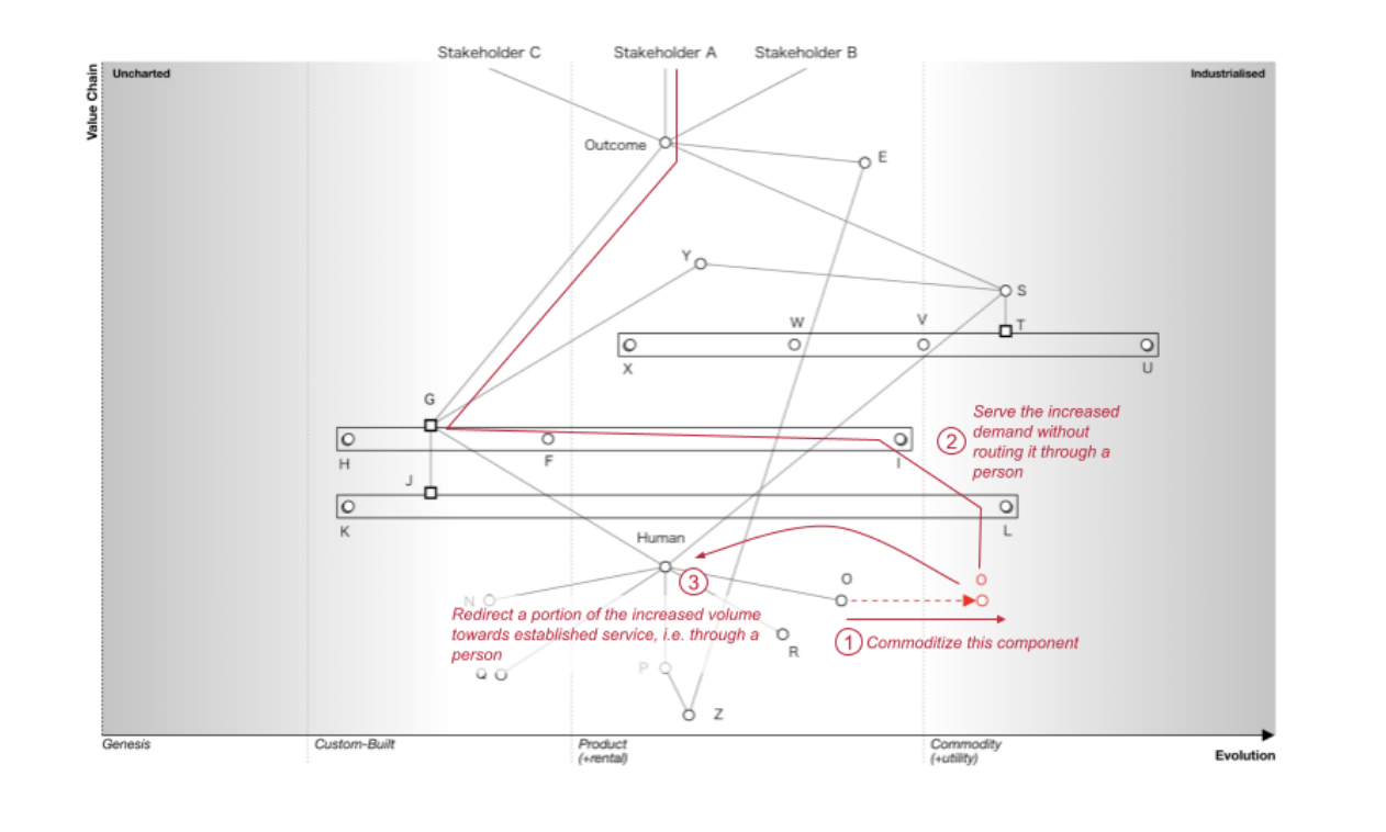
Because demand for this component got at present routed through a human and because humans are comparatively expensive, a commoditization would lead to a drop in cost and a corresponding increase in demand.
It seemed likely that the bundling with an expensive, but soon unnecessary complement would put pressure on the component to evolve.
The insight was this: what if we proactively commoditize the component and make it available online? This would release all the pent-up demand. That in turn would allow us to increase access to this sought-after component by several orders of magnitude.
The organization could serve this demand in a cost-efficient way, because it’s all commoditized, and route a share of that demand back to its traditional services.
If executed well, this play could be transformational. The agency would be able to serve a much larger number of residents in a cost-effective way (note that’s not the same as “cheap”). It could build organic reach and use that to drive demand for its other services.
In hindsight, after having pored over the maps for a few weeks, the move – and the rationale behind it – seemed obvious to everyone involved. I highly doubt, however, that we would have achieved the same level of clarity and conviction without the shared language of the Wardley maps.
Here are two excellent resources if you would like to learn more about Wardley Mapping:
A short video (the first in a series of four) by Simon Wardley, explaining the basics of Mapping
A blog post by Dave Hora that provides an excellent introduction to strategy and Wardley Mapping
I would like to warmly thank my colleagues at staatslabor, specifically Lynn Reinhart, Giulia Colella, and Dario Meloni who were part of the project team and to Lisa Brombach and Carla Mueller for helpful comments. Lynn and Giulia, in particular, did much of the essential work of drawing (and redrawing) the maps.
Our thanks, of course, also go to the unnamed government organization which kindly gave us permission to try a different way of doing strategy.
Finally, we owe all of what’s described above to Simon Wardley, the inventor of the eponymous method, and to his decision to publish all his work under a Creative Commons license (CC BY-SA). Accordingly, this article is also published under that same license.